
Is Your Website Messaging Working? A 5-Minute Test
Your website messaging is working if a stranger can tell, within about five seconds, what you do, who you help and what to do next. If they can’t, the problem is usually the message rather than the design, and redesigning won’t fix it. Try the test: show your homepage to someone outside your industry and ask what you do and who it’s for.
In short: plenty of business owners redesign their website because they feel embarrassed by it, then feel the same way afterwards. Often the design was never the problem. This post explains why clarity has to come before confidence, gives you a five-minute stranger test, and shows what unclear messaging really looks like, so you know what to change first.
Let’s be honest: a new website is an expensive way to find out your message was the issue all along.
Is your website messaging working?
Here’s a simple way to find out.
Ask someone who doesn’t know your business to look at your homepage for five seconds. Then ask them three things: what do I do, who is it for, and why does it matter? Write down what you hoped they’d say before you ask, and compare.
This kind of five-second check is widely used by marketers and testers, and it’s popular for a reason. It’s quick, it’s free, and it tells you something you can’t see for yourself. You know your business too well to read your own homepage like a stranger would.
If the answers match, your messaging is doing its job. If they don’t, that’s useful news. It means you’ve found the real problem before spending money on the wrong fix.
Why does a redesign so often fail to fix it?
Because most redesigns start with the wrong stage.
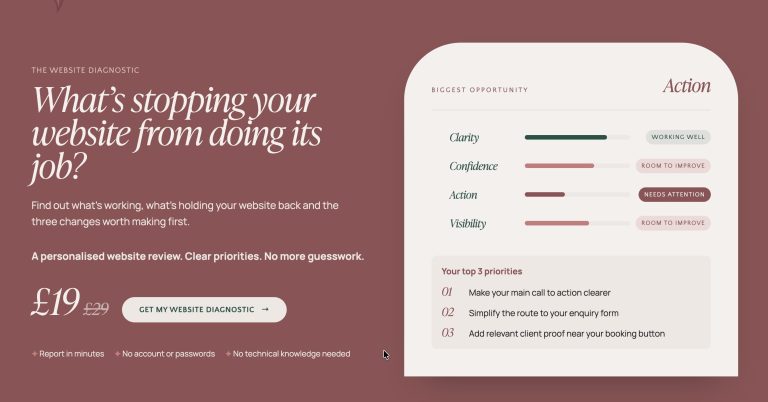
In the Website That Works™ Framework, the first stage is Clarity: knowing who you’re talking to and what you want them to remember. The second is Confidence, which is where brand, tone of voice and design direction live. The order matters. Confidence comes from alignment, and you can’t align a design to a message you haven’t pinned down yet.
So here’s the pattern I see regularly. A business owner feels embarrassed by her site. She assumes it looks dated, so she commissions a new look. The new look arrives, it’s lovely, and she still can’t explain what she does in a sentence. The words were carried across from the old site, and the same confusion is now sitting inside a better-looking frame.
Strategy comes before design. If the strategy hasn’t been done, new design just gives the same problem a nicer coat of paint.
Can a stranger tell what you do in five seconds?
Be kind to yourself when you try this. If you don’t pass first time, it isn’t a judgement on your expertise.
It’s usually a sign that you’re too close to your own work. You’ve explained it so many times that the explanation has stopped feeling like words. A new visitor has none of that background. They arrive with a problem and a few seconds of patience, and they’re looking for a sign that you’re the right person for it.
A few questions help you look at your homepage with fresh eyes:
- Does the first line say who you help, or just who you are?
- Would your ideal client recognise her own situation in it?
- Is it clear what she should do next?
If you’d answer “not really” to any of them, you’ve got somewhere useful to start.
What does unclear messaging actually look like?
It rarely looks like bad writing. It usually looks perfectly professional, which is what makes it so hard to spot.
A vague headline. Lines like “Building Better Futures” or “Solutions That Matter” sound polished but say very little. A visitor can’t tell what you actually do.
Jargon. Industry words can make you sound expert to other experts, but your potential client probably doesn’t use them. One therapist put it well on Reddit: “it’s so easy to get caught up in therapy lingo and displaying education/trainings but I think warmth and that human piece goes a long way in marketing yourself!”
Services instead of outcomes. A list of what you offer isn’t the same as a picture of what changes for the person reading. Clients are looking for the result, not the process.
Trying to speak to everyone. First make your messaging extremely specific so a potential client can immediately recognise themselves and their problem. That’s the whole job of a homepage.
What should you change first?
Before you touch the design, go back to three questions from the Clarity stage of the Framework:
- Who are you trying to reach? Pick one person you’d love to work with.
- What problem do you solve, and why should she choose you? Say it plainly.
- What do you want her to do next? Choose one action.
Then rewrite your first line so it answers the first two, and make sure the page makes the third obvious. Run the five-second test again with a different person.
You may find the design needs very little. Clarity beats cleverness, and a clear message on a modest design often does more for you than a clever one on a beautiful site.
Frequently asked questions
Is my website messaging working? It’s working if a stranger can tell what you do, who it’s for and what to do next within about five seconds of landing on your homepage. If they can’t, the message needs attention before the design does.
Can visitors understand what I do in five seconds? You can find out by showing your homepage to someone outside your industry for five seconds, then asking what they think you do. If their answer isn’t what you intended, a visitor probably won’t understand you quickly either.
Why isn’t my website converting, and is it my messaging? It can be. If visitors arrive but don’t enquire, unclear messaging is one of the most common causes, because people leave before they find out how you can help. It’s worth testing your message before changing the design.
How do I improve my website’s messaging clarity? Decide who you’re speaking to, name the problem you solve in her words, and make the next step obvious. Then rewrite your opening line to reflect all three.
Is my homepage confusing people? A quick way to tell is the stranger test above. If the person you ask can’t say what you do and who you help, your homepage is probably asking them to work too hard.
If you’d rather not untangle your message on your own, a VIP Design Day is a good way to get it sorted on the website you already have.