Create a Website That Feels Like You
Note: This post may contain affiliate links; I may earn a commission (at no extra cost to you) if you make a purchase via my links. See my disclosure for more info.
When you run a creative business it is easy to feel like your website should look a certain way. You see what others are doing and start to doubt your own instincts. The truth is the websites that attract the right clients are the ones that feel grounded, confident and true to the person behind them. When you create a website that feels like you it becomes a place where the right people feel at home.
It is also completely normal for your business to evolve faster than your website. Most women I work with feel a little disconnected from their site before they feel ready to refresh it. Nothing has gone wrong. It simply means you are growing and your website needs to catch up.
Today I want to walk you through the simple elements that help you create a website that feels like you so your online home not only looks good but reflects who you are and naturally guides the right clients toward working with you.
Table of Contents
Start with clarity on who you want to attract
Before you change anything on your website take a moment to reconnect with the clients you most want to work with. What do they value. What do they need help with. What makes them choose one designer, photographer or coach over another. When you understand the mindset of your ideal client it becomes much easier to shape a website that speaks directly to them.
Clarity at this stage removes guesswork later. It helps you choose the right words, the right visuals and the right structure so your site feels intentional rather than busy. It also strengthens your confidence because every decision has a purpose.
Use words that sound like you
Your website experience is shaped by your words just as much as your visuals. Write in the way you naturally speak. Keep things warm, clear and grounded. Your reader should feel like she is having a conversation with you not trying to decode a paragraph of formal jargon.
When your voice shows up confidently people trust you more quickly. They feel a sense of ease because your message is simple to follow. If a line feels heavy, formal or no longer true let it go. Removing what no longer fits is often the first step toward clarity.
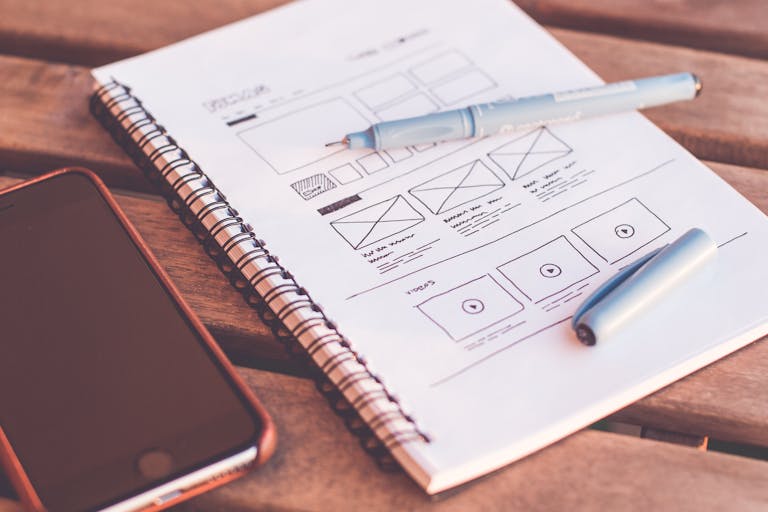
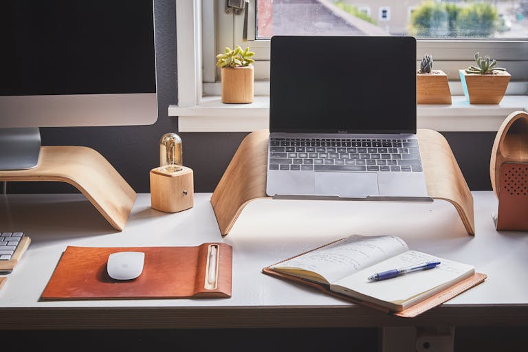
Keep your design clean and supportive
A website that feels like you does not need to be complicated. In fact simplicity often makes your personality shine more clearly. Use colours, typography and layout choices that support your message rather than compete with it. Good design creates space for your words and your work to breathe.
Your visuals and your message should tell the same story. When they align your reader feels the clarity behind your business immediately.
A clean layout also reduces overwhelm for your reader. When she knows where to look next she feels guided rather than lost.
Make your navigation effortless
If your visitor has to work out where to click she will often leave. Clear navigation is one of the biggest factors in creating a positive website experience. Keep your menu simple. Avoid hidden pages and long dropdowns. Lead people towards the pages that matter most like your services, your about page and your contact page.
When your site feels easy to move through it creates a sense of calm confidence. That feeling alone can be the difference between someone leaving and someone enquiring.
Small choices like readable text sizes and clear colour contrast also help more people feel welcome on your site. Inclusivity is part of creating a website that feels genuinely you.
Show the journey of working with you
Your website becomes far more compelling when it helps your reader imagine what it is like to work with you. Share your approach. Explain how you support clients from the first hello to the final handover. Use examples and simple steps so your reader feels taken care of from the moment she lands on your site.
This clarity builds trust. It also reduces the doubts that often stop someone making an enquiry.
Invite her to take the next step with ease
If you offer a focused and supportive service like my Design Days make sure your website guides your reader towards it in a calm and confident way. I like to weave gentle invitations throughout the site rather than rely on a single call to action. This helps your visitor understand that there is a simple path forward and she does not need to stay stuck with a website that no longer reflects her.
Your invitation does not need to be loud. It simply needs to be clear.
Let your personality come through
The most powerful websites feel human. Show a little of your process. Share why you care so deeply about the work you do. Use images that reflect your style and make space for the quirks that make you memorable. When you show up as yourself you attract people who feel aligned with your energy and values.
This is where the right clients start to feel a real connection with you.
Give your reader a sense of relief
Your goal is not to impress. It is to create ease. When a potential client leaves your website feeling clearer, more supported and more confident in her next step you have done your job. A website that feels like you holds space for her to breathe and feel hopeful about what is possible.
You do not need a full rebrand to create a meaningful shift. A few intentional changes can bring your website back into alignment surprisingly quickly.
Final thought
Your website is more than a collection of pages. It is a place where your message, your personality and your client’s needs come together. When you shape that experience with intention you attract the kind of clients who value your work and are excited to invest in it.
If you are ready for a focused and supportive refresh that brings your website back into clarity my Design Days offer a simple and collaborative way to get there.