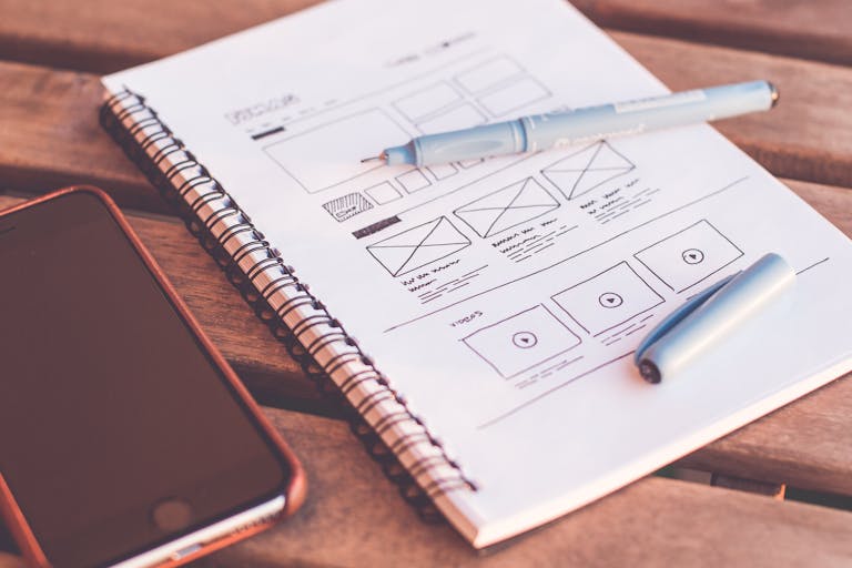
Beautiful Website Design that Enhances User Experience
Note: This post may contain affiliate links; I may earn a commission (at no extra cost to you) if you make a purchase via my links. See my disclosure for more info.

A website is often the first impression a potential customer has of your brand, so it’s crucial to make it count. A beautiful website design that enhances user experience can ultimately lead to increased engagement, sales, and customer loyalty.
Here are some tips on how to create a website design that is both beautiful and functional:
Table of Contents
Keep it Simple
Simplicity is key when it comes to website design. A cluttered and confusing website can turn users off and lead to high bounce rates. Keep the design clean and minimalistic, with plenty of white space and a clear hierarchy of information. Use a consistent colour scheme and typography throughout the website to ensure a cohesive and polished look.
Prioritise User Experience
User experience should be at the forefront of any website design. The website should be easy to navigate, with a clear and intuitive layout. Users should be able to find the information they’re looking for quickly and easily. Incorporating features such as a search bar and breadcrumb navigation can further enhance user experience.
Focus on Mobile Responsiveness
With the rise of mobile devices, it’s crucial to ensure your website design is mobile-responsive. This means that the website is optimised for viewing on smaller screens, with easy-to-click buttons and clear text. A mobile-responsive website not only enhances user experience but also improves search engine optimisation (SEO) and can lead to increased traffic and engagement.
Incorporate High-Quality Visuals
Visuals are a powerful tool in website design. Incorporating high-quality images, videos, and graphics can not only enhance the aesthetic appeal of the website but also increase user engagement. Use visuals strategically to break up text and highlight key information.
Utilise Calls to Action (CTAs)
Calls to action (CTAs) are an essential component of website design. A clear and prominent CTA can encourage users to take the desired action, such as making a purchase or filling out a contact form. Use contrasting colours and strong, action-oriented language to make the CTA stand out.
Test and Optimise
Website design is an ongoing process, and it’s important to test and optimise regularly. Use tools such as A/B testing to compare different versions of the website and determine which design elements are most effective. Analyse website data to identify areas for improvement and make changes accordingly.
I understand the importance of a website design that not only looks beautiful but also enhances user experience. By prioritising simplicity, user experience, mobile responsiveness, high-quality visuals, calls to action, and ongoing optimisation, I can create you a website that not only looks great but also drives engagement and sales. So find out how I can create a beautiful website design that enhances user experience for you.


