How to design a successful homepage – 7 Tips
Note: This post may contain affiliate links; I may earn a commission (at no extra cost to you) if you make a purchase via my links. See my disclosure for more info.
Your homepage is the face of your website, the gateway to your digital presence. It’s where most visitors will land first, making it your prime opportunity to create a stellar first impression. In my opinion, a homepage should not only look appealing but also function flawlessly to keep visitors engaged. Here are my seven tips on how to design a successful homepage, incorporating the latest web design and user experience (UX) trends.
Table of Contents
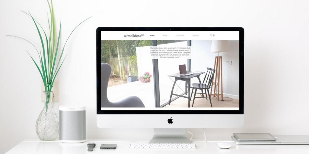
Logo
Brand your business
Your logo is the cornerstone of your brand identity. People expect to see it prominently displayed, usually in the top left corner or centre at the top of your page. This is a standard practice because it helps users quickly identify your brand and provides a familiar navigation point, as clicking the logo should return users to the homepage.
You don’t necessarily need a professional designer to create an effective logo. There are numerous tools available, like Canva, that can help you design a beautiful logo using just text and background colour. Remember, simplicity often works best, ensuring your logo is recognisable and memorable.

Navigation
Keep it simple
Your visitors are often in a hurry, spending less than twenty seconds on your homepage before deciding whether to stay or leave. Therefore, your navigation must be intuitive and straightforward. Limit the number of navigation links to no more than eight and prioritise them from left to right according to importance.
People are accustomed to two main types of menus: horizontal and vertical. Stick with these familiar layouts to avoid confusing your users. Ensure essential links like ‘Contact’ are placed where users expect to find them, typically at the end of a horizontal menu or the bottom of a vertical one.
Visuals
Don’t settle for “okay” images
Visuals play a crucial role in making a strong impression. Neuroscience shows that people process images much faster than text, making them essential for communicating your brand’s message quickly and effectively. Investing in high-quality, professional images can significantly enhance the visual appeal and perceived value of your site.
If hiring a professional photographer isn’t feasible, consider using tools like Canva to enhance stock photos by adding text and filters. This can make even generic images feel unique and tailored to your brand.

Copy
Clear and concise
Writing for the web is different from other types of writing. People tend to scan rather than read every word, so your copy needs to be clear, concise, and compelling. Aim to include at least 500 words on your homepage to improve SEO, but make sure the most crucial information is immediately visible without overwhelming the user.
Here are some tips to help get your message across:
- Use subheadings, lists, and icons to break up text and highlight important points
- Utilise lists to cleverly outline any necessary details
- Captions for images can also help clarify their relevance without requiring extra effort from the user
- Use icons to help present information in a more consumable format
- For particularly complex messages, consider using videos—they’re engaging and can convey a lot of information quickly
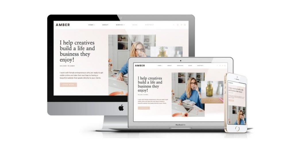
Above the fold
First impressions count
The content visible before a user starts scrolling (above the fold) is critical. This section should include your most important elements: a clear headline, a compelling visual, and a strong call-to-action (CTA). Your CTA should be prominently displayed and clearly state what you want the visitor to do next.
Crafting a professional headline that sets you apart and reinforces your brand identity is key. Make sure your logo and a concise value proposition are visible above the fold to immediately inform visitors about who you are and what you offer.
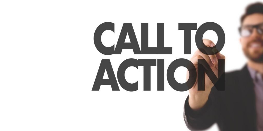
Call to action
Benefit-orientated
Every homepage needs a clear CTA. Whether it’s to “Shop Now”, “Learn More”, or “Get Started”, your CTA should be unambiguous and prominently placed. The wording of your CTA is crucial—focus on the benefits to the user rather than generic commands.
For example, “Get Your Free Quote” is more compelling than just “Submit”. Experiment with different phrasings to see what resonates best with your audience. Testing and iterating on your CTAs can lead to significant improvements in conversion rates.
Load time
Speed matters
A fast-loading homepage is essential. Studies show that over 50% of users will abandon a website if it takes more than three seconds to load. This means optimising your images and other media to ensure they don’t slow down your site.
Use tools like Google’s PageSpeed Insights to identify areas where your site’s performance can be improved. Compressing images and leveraging browser caching are simple yet effective strategies to enhance load times and keep visitors engaged.
Keeping Up with Trends
Staying current with web design and UX trends is vital for maintaining a modern and engaging homepage. Here are some of the latest trends to consider:
- Minimalism: Clean, uncluttered designs help users focus on essential elements and improve the overall user experience.
- Dark Mode: Offering a dark mode can enhance readability and reduce eye strain, providing a better user experience.
- Micro-Interactions: Small animations or feedback signals that occur in response to user actions can make your site feel more interactive and engaging.
- Voice User Interface (VUI): With the rise of voice search, incorporating VUI elements can make your site more accessible and user-friendly.
- Personalisation: Tailoring content based on user data can create a more customised and engaging experience.
Conclusion
Designing a successful homepage is about balancing aesthetics with functionality. Every element, from your logo to your call-to-action, plays a crucial role in creating a seamless and engaging user experience. Regularly revisiting and updating your homepage ensures it continues to meet your business goals and stays aligned with current trends and user expectations.
Remember, there is no one-size-fits-all template. The best homepage for your business will be the one that effectively communicates your unique value proposition, provides a great user experience, and encourages visitors to take action. By following these tips and staying attuned to the latest trends, you can design a homepage that not only attracts visitors but also converts them into loyal customers.