Logo Design Essentials – What startups need to know
Note: This post may contain affiliate links; I may earn a commission (at no extra cost to you) if you make a purchase via my links. See my disclosure for more info.
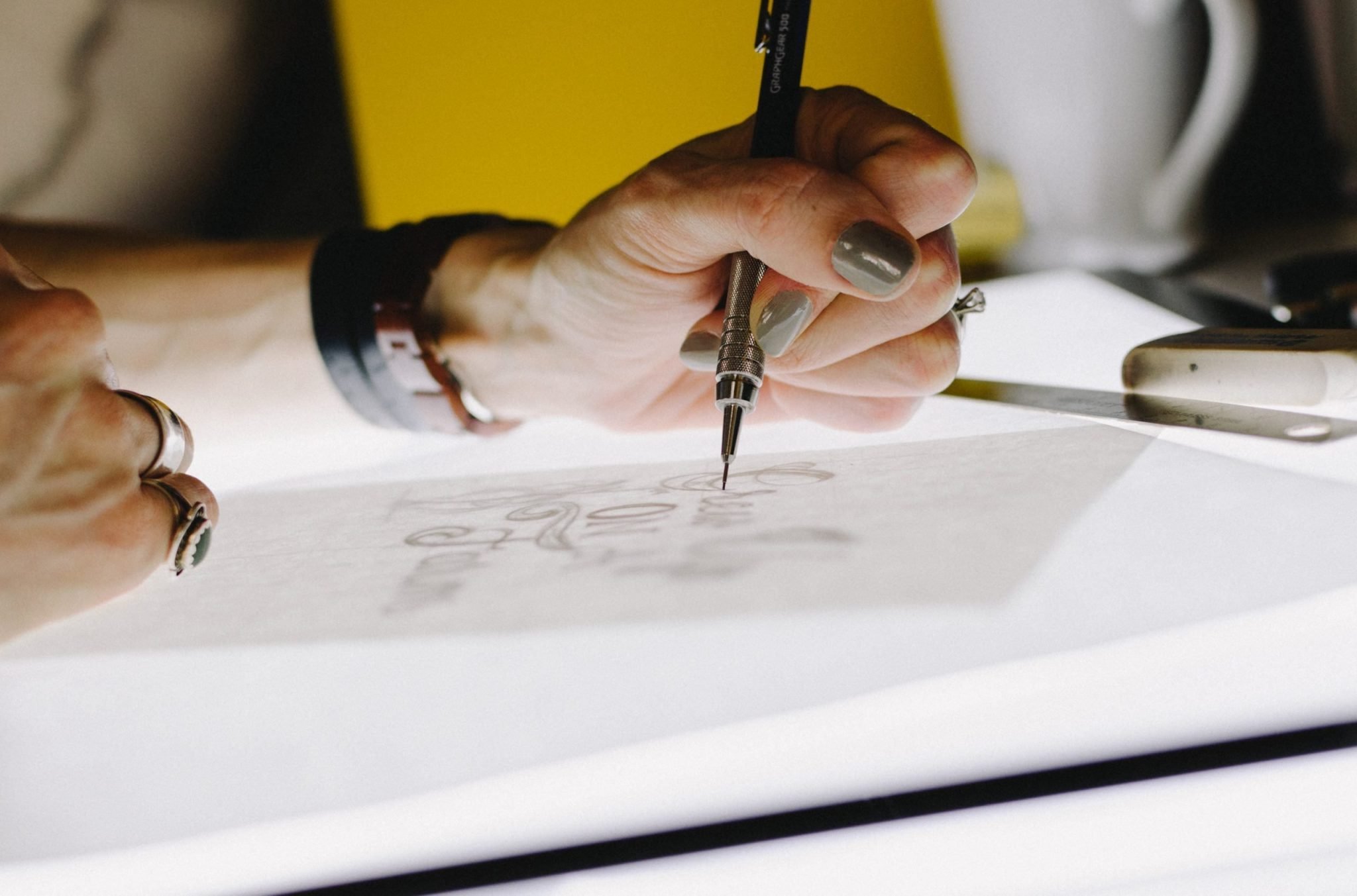
When starting a new business there are so many different elements to consider. What started out as an exciting new venture has quickly turned into an ever-growing To Do list! You may think that logo design is not a vital element to getting your business off the ground. It can be argued that the smaller the business the more vital great logo design is. Well-established brands already have advocates who connect with their brand emotionally and don’t need to communicate their message as loudly as smaller companies who are fighting for their share of the market.
Table of Contents
What Can A Logo Do For Your Business?
A logo inspires trust in your brand. Without the initial enticement of a great logo, will customers choose to engage with your product/service? It’s unlikely you would choose to trust a brand or product that has no clear representation, so don’t fall into this trap when starting your business. It’s very easy to push these things to the back burner, but trust is a vital part of growing the success of your business and a logo-less company is, essentially, a faceless company. A visual identity creates a familiarity with your brand that you can’t afford to miss.
Today everybody wants their brand to be recognised and remembered. Your logo plays a big part in that scenario. When your brand’s logo is processed by the viewer, a thousand subconscious thoughts rush through their mind, and a well-designed logo has the ability to make these thoughts connect positively or negatively. One of the best ways to send a specific message to your customers is through a strategically designed logo that communicates your brand’s message in an instant.
There are a lot of factors that go into making a good logo that can help your brand stand out from the competition. We’ll go through the basics of creating a memorable business logo, from getting inspiration to the essential elements you must consider for your logo design.
Discover Your Brand Personality Before Creating Your Logo
Many startups want to dive right in and design their logo before they have thought out what their brand stands for. Before you create a new business logo, it’s imperative that you first decide on your brand personality and think about the story behind it. A large part of your brand identity is the emotion it transmits. Emotional branding and its foundation is based on storytelling and your brand values. It can help your brand stand out from the competition and enhance brand recognition by creating a human connection. It also improves customer retention and brand loyalty and increases word-of-mouth recommendations.
Look For A Connection

What does your brand represent? Whether you answer this in a single word or a sentence or a paragraph, what really matters is for your logo to get your message out to your target audience effectively.
Look for a link that connects your business to the logo you’re considering. Your customers need to understand this well, and be able to associate your logo and brand effortlessly.
Your logo has to be relevant to your business and industry type. A kids play centre can do with a relaxed and lighthearted logo with some fun elements, whilst a gym would do better with elements conveying strength. The end goal is to ensure that your target customers know what you stand for.
When you choose your logo style and design, make sure you keep in mind the preferences of your target audience. If you are targeting professionals, your logo design should be clean and elegant. If you are targeting children and teenagers, it should be playful and colourful and so on.
This way the audience can connect with your logo easily and ensures that there is brand memorability.
Match The Logo Aesthetic To Your Brand
As you launch your business, clearly define if you wish to choose a minimalist, elegant or quirky personality and tone. This will not only play a significant role in the logo designing process but also set a tone for your future branding strategies.
Below are the most common logo design styles. Which does your business brand match? Find inspiration in the style that most resembles the feeling of your brand.
- A minimalist design is all about the “less is more” approach. Use simple sans serif fonts and a minimal amount of colour. This style can work for any type of brand, as long as their brand story matches the aesthetic.
- Vintage styles use old-style logos with imagery and colours that remind you of another era. This design style works best with businesses that want to tap into nostalgia or that work with literal vintage products.
- Iconic logos use a symbol or icon to depict a brand. These can be used with almost any business and have a clean, modern edge.
- Signature logos are just that: a signed name turned into a logo. You can also use a script font to create a stylised signature. This style is perfect for individual professionals that want to make a mark with their name.
- 3D logos are unique and eye-catching. They tend to have a futuristic or graffiti-style feeling to them. A 3D logo can be heavy and colourful.
- Hand drawn logos are very unique and special. The style of the letters and imagery maintains a hand-drawn feel even though it’s digital. These types of logos are great for children-related businesses or handmade product stores.
- A watercolour logo is usually quite feminine and pretty. The watercolour effect can be combined with flowing fonts for a complete feminine style or with a heavy font to make it more gender-neutral.
- A freestyle logo doesn’t exactly fit into any other category and can range from an artsy sketch to a technical drawing. The idea behind a freestyle design is that there is nothing like it and is only inspired by other aesthetics.
Where Can I Find Inspiration For My New Logo?
When looking for inspiration, it’s a good idea to check out your competition. You will find great ideas of what is working and what’s not, and what is engaging their customers. Keep in mind the concepts behind these ideas. When you study your competition, do not copy the exact concepts. First, it portrays your business as unprofessional but more importantly defeats the whole purpose of the logo. The key is to make yourself distinct. The target audience must be able to tell you apart from your competition. Your logo design must be unique for it to stand out from the crowd.
Keep your eyes open; inspiration can strike anytime anywhere. It could be a colour scheme, typography or even a symbol which inspires your own logo design idea. Do not disregard a design even if it may be irrelevant to your business but a great design overall. Throw the net out wide and have a look at businesses outside of your niche too. You may never know how design can become a starting point for your own design.
Understand What Makes A Good Business Logo
Logo design is a demanding process. It takes time, and you may even feel stuck by so many things to be kept in mind. The key is to ensure that your logo is effective and recognisable. Your target audience must be able to identify your business and pick you out from the rest.
Another vital need is that your logo must be memorable and also make a good first impression. You don’t want people to remember it in a negative light. Good first impressions are the basis of a good business logo. If your logo is not memorable, if it is not able to leave an impression in the minds of your audience, they won’t be able to identify it. If your logo is memorable, it acts as a foundation for reliability. People start associating a sense of well-known brand with your company.
Your Logo Design Must Be Simple Yet Distinctive
One of the best pieces of advice when creating your logo is to keep it simple. Effective logos have a number of desirable qualities, and clarity – achieved through simple design – is at the top. Ensure your logo is a clear and uncluttered presentation of your business’s brand identity. Simple designs go a long way. They are easy for your audience to understand and remember.
You may have done a lot of research on what works visually and a logo with a complicated design might appeal to you at first glance, but no matter how tempted you are to pack it all into your logo design, just focus on one or two main elements. If you choose a logo that has too much going on, you’ll end up confusing your customers. Complicated designs are also hard to remember, so if you want your logo to be etched onto the minds of your target audience, keep it simple.
The Logo Design Must Be Relevant
A logo is a representation of your business. This makes it pivotal that the logo is relevant. You wouldn’t find a bike in the logo for a dentist, would you? Whilst you want to avoid cliches, to stand out your logo design must not lose its relevance. Make sure you use icons and visual elements that help the audience connect your logo to the respective industry, product or service, without being cliche.
Aim For Balance
As you work towards creating an effective logo, you should aim to strike a balance.
The text and imagery should be proportionate in size and create a harmonious visual effect. An imbalanced logo would be weighted on one side of the design, while a balanced logo design portrays a simple yet powerful image. Look to create symmetry in the design for an overall balance and make sure that the logo works well on different background colours and visuals.
What Colours Should I Use For My Logo?
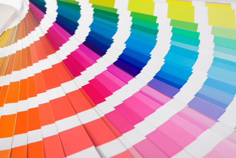
As humans, we all respond well to visual stimulation, with colour affecting our decisions both consciously and subconsciously. Colours represent feelings and each colour leaves a different impression on the viewer’s mind. Needless to say, the colours you use in your logo can greatly impact the way users perceive your logo and brand. The colour you use in your logo must match your brand identity and it needs to be the right shade of that colour as it sets the tone for your business. A carefully chosen colour palette can get half of your marketing job done.
We instinctively attach meaning to colours, so ensure you’re using a colour that appeals to your target audience. Colour plays an important role in how your brand is perceived. It is commonly known that women are attracted to softer colours and men to brighter ones, so use this information when deciding on your business logo colour combinations! This gives you the chance to personalise your logo so that your customers connect to your brand instantly.
How Many Colours Should My Logo Have?
A common mistake startups make while creating startup logos is to add lots of colours to make it attractive. This can end up making the logo look too busy. Try and stick to a maximum of 3 primary colours when you design a logo. It’s worth bearing in mind the colour wheel when using multiple colours in your business logo. Studies show that palettes with similar hues are well-received by viewers, but using accent colours can actually be the most effective! Just be mindful of well-ingrained colour combinations that are hard to shake. For example, green and red are Christmas colours and orange and black are reserved for Halloween.
Let’s look at the science behind colour, so you can make an informed decision about which colours to include in your logo.
- Green connotes compassion, nature, and wildlife. It is used by most organic or ecologic minded brands. This is so common that consumers expect it if you have an environmental aspect of your business. If your business is in that niche, you’re better off sticking with green in your logo so that consumers will associate it instantly.
- Pink is one of the most gender-associated colours for logos. The majority of feminine brands use pink in logos and branding. Go with pink if you want your brand to fit in that space. But if you want to stand out and appeal to anyone that identifies as a woman, choose another colour.
- Blue is a classic colour for corporate logos. It is a dependable colour that is well perceived all around as it comes across as professional and trustworthy.
- Purple is commonly known as a royal or spiritual colour. It’s widely used in the health and wellness field and also in the feminine industry. Using purple in an industry that doesn’t fit those niches is risky but if done well can be successful and memorable.
- Red is highly noticeable, impactful and demands a call to action. It makes an impression and evokes feelings of passion, excitement, and power but will also evoke danger and caution. Choosing red for your logo can make it feel more dynamic. It can even make you feel hungry! Now you know why a lot of restaurants and food chains use red in their logos and interiors.
- Orange logos are generally cheerful and vibrant. The shade of orange used is really important as there is a short-range of orange shades that evoke positive feelings. If using orange, keep it vibrant and happy.
- Yellow logos are not very common, so it will call attention to your logo straight away. Nevertheless, yellow isn’t suitable for all types of businesses. It’s typically more of a lighthearted happy colour. Stay away from yellows that look sickly or too green.
- Brown is one of the least used colours for logos, but that doesn’t mean you shouldn’t use it. Use a shade of brown that looks more like chocolate or coffee and stay away from green-toned browns. Brown works well with natural, organic products with sustainable packaging design.
What Font Should I Use?
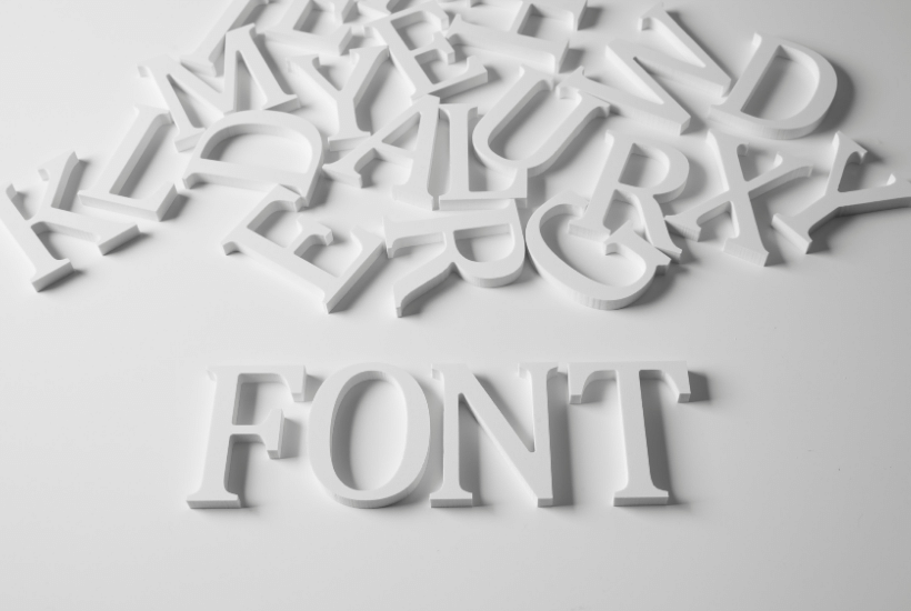
Similar to colour psychology, fonts and typography also carry emotions and perceptions. The fonts in your business logo must be a continuation of your brand identity, just like the colours and visuals. The type of font used in your logo can speak volumes about your brand. Fonts are available in a plethora of styles, but they can all be grouped under one of three main categories- serif, sans serif and script fonts.
By using the psychology of fonts, you can start to narrow down your font options. For instance, Sans Serif fonts are perceived as stable, clean and modern, while Serif fonts are traditional, professional and reliable. Think about your unique brand identity and decide which font category most closely represents your identity.
- Serif: These are fonts with letters that have little extensions at the ends. Serif fonts are elegant and generally easy to read. They are mostly used by academic institutions and newspapers as they give off a professional vibe.
- Sans Serif: The opposite of serif, these letters don’t have extensions at the end. They are clean, easy to read and generally carry a fun and easy-going appeal. They will help your logo come across as modern. This font is a favourite and is widely used by tech startups and lifestyle blogs.
- Slab: Fonts with thick sans serif letters in a very heavy style are called slab fonts. This style of typography works really well for a logo as long as the brand identity matches the feeling it evokes. A low heavy slab font can represent dependability and confidence.
- Script: Calligraphy and handwritten fonts are made up of connected letters, much like the script we use to write. Script fonts are the typography of choice for signature fonts but can also be combined with a sans serif or serif for a combined logo style. They exude personality and can be fancy, elegant or casual.
- Novelty: Novelty fonts, also called display fonts, carry a heavy cultural or creative impact. These are the most difficult fonts to use for a logo. Only use a novelty font if it makes sense with your brand identity.
Most people believe that a logo is all about image and graphics, but contrary to popular belief, a good logo can also be devoid of any image or icon entirely. The best examples for such logos are Google, Coca-Cola, and Nestle. Known for their unique lettering, these logos are legendary and were created using only text.
Therefore make a point of researching as many fonts styles as possible to find the right one for you. Try Google fonts to find a font that fits your brand and have a look at our Pinterest boards to gain some inspiration.
Design For Your Future Business
Make sure your startup logo design is adaptable and scalable. A complex logo will never reproduce well at smaller sizes and might even become unrecognisable in print! Your logo design needs to look great on all kinds of surfaces and in all sizes.
Today your brand might be a startup but in five years time you could be printing your logo on merchandise, receipts, or even entire buildings. A logo that can transcend paper, such as Chanel’s simple design, can be used in the digital and physical worlds and will enjoy more success than an overly complicated logo.
Integrate Your Logo Into Your Branding Material
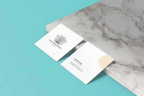
Once your logo is finalised it’s time to integrate it into your branding material. Your logo should be added to every visual aspect of your business brand, from website to printed flyers and invoices.
Below are some examples of how and why to integrate your logo design into your branding material:
- Your business cards need to have your logo on them, not just your name and contact details. A business card is easily the no.1 branding asset when it comes to meeting people in person.
- Email signatures, letterheads and newsletters must all have your logo on them so that every communication you send out will be recognised as yours.
- Social media channels should all include your logo so your business logo becomes recognised as part of your message.
- The list goes on but essentially the point is that your logo must be on all brand materials so that all your visual assets are cohesive and on-brand.
Conclusion
A logo is all about attracting people to consider buying your products and services. When you put your heart and soul into building a business from the ground up, it should reflect in your company logo design. Your logo can prove instrumental in forging an emotional connection with your audience. When you have a business logo that makes a positive first impression, it will have a lasting effect. Use emotional branding to help boost the impact of your logo. Take your time to find your brand personality. You need to be sure that your personality and brand values come through your business logo.
As a startup you have to manage all the necessary actions on a restrictive budget. You may need to cut corners wherever possible to make room for all the critical tasks. Your business logo design should not be one of the avenues that you cut. Always keep in mind that there are no shortcuts to great logo design and all businesses should aim at a great logo design for it to work. After all, your logo will become the face of your company.
So use these tips to get your business started off on the right foot with a logo that works for you. With the information provided here, you’re now fully armed with the basics of designing a functional logo that is as unique and memorable as your business!
Logo design is a complicated task to undertake, and crafting your brand’s visual identity is an involved process for a new business. We’re here to help you! Using our plethora of knowledge and expertise to guide you through the process, we’ll help you avoid expensive logo mistakes.


